We create strong impressions with packaging that reinforces branding.
As consumers ourselves, we also appreciate the value that a well-designed packaging system can add to your brand. We offer a full plate of packaging, merchandising and retail display design capabilities – from initial sourcing through structural design and custom component production – with an eye toward creating a cohesive brand program that makes an emotional connection with consumers at the point of purchase.
First Leaves
First Leaves wanted to introduce their fine specialty green tea into the US market while maintaining their authentic Japanese heritage. Our solution for their identity was a stacked word mark incorporating the owner’s family crest, for a modern take on a traditional Japanese stamp or seal. Clean, simple typography telling the tea’s flavor story was paired with bold photography of the product inside, with circular shapes that mimic the family crest. An expanded story, clean infographics and icons, and simple directions on the side and back panels helped to round out the rich story of the product.
Winner, American Package Design Awards
Pacific Bird
In rebranding the Pacific Bird & Supply Co. wild bird food and treats line, our biggest challenge was getting past the “icky” perception of the product – which was essentially bugs. Our solution balanced the beauty of birds and nature with bold, honest representations of the insects inside the cans.
Winner, American Package Design Awards


PureGear
PureGear’s point of difference was designing simple and straightforward accessories that were often multi-use and affordable. A clean, fresh, and modern approach was taken in the packaging to communicate product benefits. A strong lifestyle-centric element was used in all the concept directions to support PureGear’s story and create an optimistic and inspired brand that would quickly connect to its market.
Winner, American Package Design Awards + American Graphic Design Awards
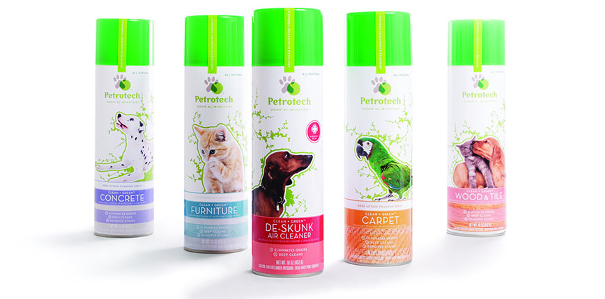
Petrotech Odor Eliminator
This re-packaging of an all-natural pet odor eliminator line fused emotional and energetic animal photography with branded informational icons and a color-coded system for quick and easy navigation on the shelf.
Published, Graphic Design USA + Package Design Magazine

")
Teen Everyday Skincare System (TESS)
Fun, fresh colors inspired by this fruit-infused product paired with meaningful affirmations and a clean step-by-step system made for an honest, approachable solution for this teen skincare line.
Winner, American Package Design Awards + Print’s Regional Design Competition + CPC Magazine + Package Design Magazine
Make-Up Designory
For this make-up school and cosmetics line, clever and informative product copy fused with subtle diagrammatic illustrations for a sophisticated, upscale feel; a color system made for simple and clear product categories. Our retail display solution was an ultra-modern, eye-catching, compact design that made a bold visual impact while remaining functional and practical for use as a tester unit within the salon or spa environment.
Winner, American Package Design Awards + American Graphic Design Awards
Published, GCI Magazine, HOW Magazine, + Package Design Magazine


Furrever
The packaging system for the dog grooming line Furrever had to balance the scientific benefits of the product with the company’s commitment to the environment. Clean, organized product benefits and molecular “bubbles” gave the packaging a credible look, while emotional animal photography and an earth-themed identity communicated the emotional benefits.
Winner, American Package Design Awards
Published, HOW Magazine
Agera
Beauty and science were equally balanced in this ultra-clean packaging for a comprehensive line of medical skincare products. Color coding, supplementary icons, and an organizational lettering system simplified this complex 95+ product system.
Published, Package Design Magazine


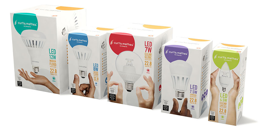
Curtis Mathes
For Curtis Mathes’ flat screen packaging, energetic, expressive lifestyle photographs of “real people” interacting with entertainment was the focus of the new packaging for this well-known electronics brand, contrasting the competitors’ emphasis on product benefits. A bright, fresh color palette and repeatable pattern on the cartons created a unique wallpaper effect when stacked on the shelf. We continued the lifestyle element in the LED light bulb packaging by bringing in a human touch using hands playfully interacting with the product.


